Mobile product discovery shapes how shoppers find items in fashion and lifestyle apps. This piece looks at how people discover products in apps.
Discovery paths include home feeds, search, saved lists, and external links that open the app.
The goal is simple. It helps product teams and designers understand browsing habits and spot design ways to improve findability.
It also measures what matters most. The explanations are short and practical, for mobile users who scroll, tap, and decide fast.
Ads
The article is arranged so readers can jump to key topics: fundamentals, browsing, search, navigation, and personalization.
It also covers visual design, acquisition channels, and measurement. Along the way, it references brands like Instagram shopping and Shopify storefronts as examples.
Key Takeaways
- Product discovery in ecommerce apps happens across multiple entry points: feeds, search, notifications, and external links.
- Browsing behavior varies by intent; design should support both quick scans and goal-driven searches.
- Search relevance and clear navigation are core to findability and faster conversion.
- Personalization and visual hierarchy boost relevance but should leave room for serendipity.
- Measure discovery with engagement, conversion, and time-to-find, then iterate with A/B tests and qualitative feedback.
Understanding product discovery in mobile and ecommerce apps
Product discovery means how people find items to buy. It includes both searching and casual browsing. This journey moves from awareness through consideration to final choice.
Definition and scope of product discovery
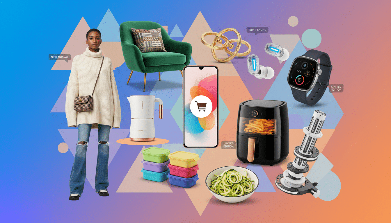
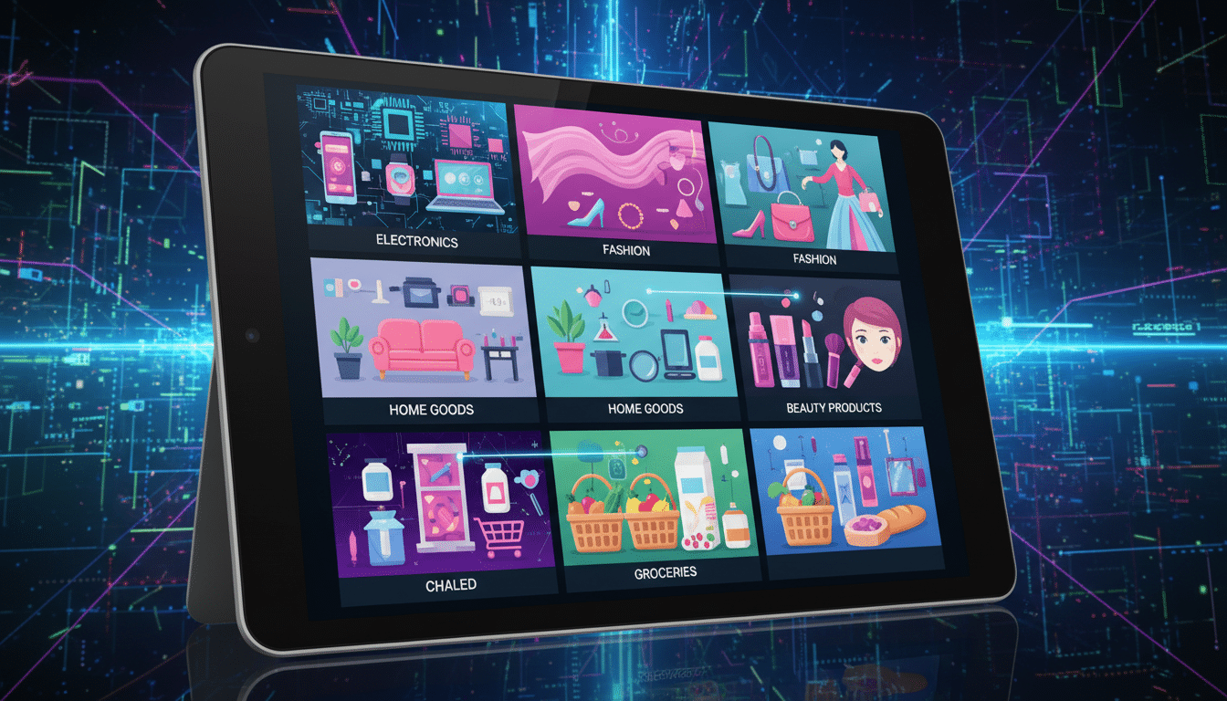
Product discovery combines tools and experiences that help users find what they want. In fashion apps, it includes filters, search autocomplete, curated feeds, and promotions. Each step guides shoppers toward a product view or an add-to-cart action.
Why mobile product discovery matters for ecommerce apps
Mobile discovery is crucial because screens are small and attention spans are short. Clear layouts and easy-to-scan cues remove barriers to buying. Better discovery increases retention, order value, and customer lifetime value.
Key metrics to measure discovery success
Track a few key metrics to see how well users find products in apps.
- Engagement — sessions per user, time on discovery pages, and scroll depth on feeds.
- Conversion — add-to-cart rate from discovery pages and checkout conversion by discovery source.
- Time to find — median time from app open to product view or add-to-cart; search success and zero-result rate.
- Secondary signals — saves, likes, shares, and repeat visits to recommended products.
Measure these metrics by channel — search, feed, push, and social — to find weak spots. Expect differences across users and categories. Report ranges instead of single guarantees.
User browsing behavior and decision-making in apps
Mobile shoppers have clear habits that guide product discovery in ecommerce apps. Design should respect user intent. This helps users move from browsing to choice smoothly.
How browsing patterns differ between casual and goal-driven shoppers
Casual browsers explore to get inspired. They spend time in visual feeds, tap looks, and enjoy discovery paths with curated edits.
Goal-driven shoppers arrive with a specific goal, such as finding black ankle boots. They use search, filters, and sort options to get fast, precise results.
Common on-app behaviors: scrolling, filters, search, and saves
- Scrolling: Users scan vertically and judge cards by image and price within a second.
- Filters and sorting: These narrow long lists. Dropouts rise if controls are hidden or hard to reset.
- Search: Typed queries and autocomplete guide many journeys. Zero results often end sessions.
- Saves and wishlists: Lightweight commitments signal later recommendations and remarketing.
Psychology of choice and how it shapes in-app exploration
Too many options cause decision fatigue. Curated assortments and progressive disclosure cut cognitive load. This speeds up product discovery.
Visual cues like high-quality images and styling context help users see how pieces fit into real life. This lowers returns and builds confidence.
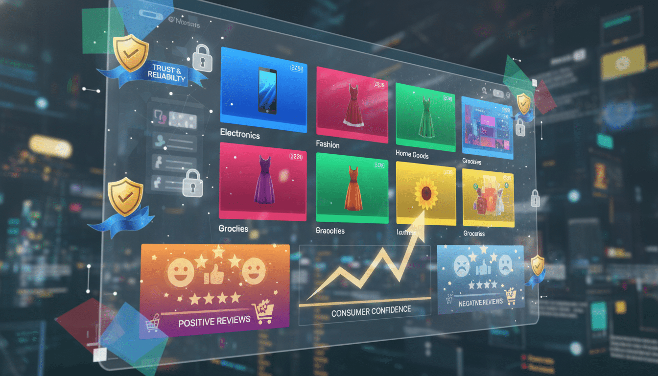
Social proof, such as ratings and saved counts, boosts trust when shown clearly on small screens. Authentic, readable signals matter more than flashy badges.
Practical tip: Match flows to intent. Offer inspiration-first entry points for casual browsers and fast search-plus-filter paths for goal-driven shoppers.
Search and navigation patterns that drive findability
Good product discovery depends on fast, forgiving search and clean navigation. Mobile users expect quick answers and visual cues. They want paths that avoid dead-ends.
This section breaks down practical patterns for ecommerce apps. These patterns help people find the right piece fast.
Why search relevancy matters
Search relevancy starts by mapping real queries to catalog terms. Synonyms, misspell corrections, and intent mapping help. They turn casual phrases like “mom jeans” into accurate results.
Autocomplete and recent searches speed up discovery. Showing small images in suggestions gives visual confirmation.
How to measure query health
- Track zero-result queries to fix gaps.
- Monitor time-to-result and search-driven conversion.
- Log popular synonyms to expand the index.
Navigation structures that reduce friction
Top-level categories keep choices simple. Progressive disclosure hides deep options until needed. This prevents overwhelming the screen.
Breadcrumbs help users see context and go back after deep dives.
Mobile-first navigation patterns
- Bottom tabs for main areas.
- Swipeable carousels for curated picks.
- Contextual quick filters to save screen space.
Faceted search and intelligent filtering
Offer relevant facets like size, color, price, fit, and occasion. Show active filters with clear remove actions. This lets users adjust without guesswork.
Smart filter behavior
- Hide sizes that are out of stock to avoid dead-ends.
- Adapt available options based on inventory and user signals.
- Show inline product counts and visual chips to guide choices.
Putting it together
Combine strong search relevancy with intentional navigation patterns and adaptive filters. This mix improves product discovery.
It cuts the time users need to find what they want in ecommerce apps.
Personalization and recommendations to surface relevant products
Personalization shapes how users find items inside ecommerce apps. A clear strategy helps make product discovery feel natural, useful, and inviting on mobile screens.
Personalized feeds keep a running stream of items that match a user’s tastes and past behavior. They work well for inspiration and long-term retention.
- Always-on learning from views, clicks, and purchases.
- Curated for style, brand affinity, and size preferences.
Triggered recommendations appear after a user takes an action, like viewing a product or adding to cart. These are higher intent and aim to nudge the next step.
- Show related items after a product view.
- Prompt complementary pieces at checkout.
Signals feed both approaches. Behavioral signals include time-on-product, saves, and past purchases. Explicit preferences cover sizes, favorite brands, and style tags set during onboarding.
Contextual signals reflect session intent, device, time of day, and inventory near the user.
- Combine behavior, preferences, and context for smarter matching.
- Weight recent actions higher for timely relevance.
- Allow users to edit preferences to refine results.
Balancing relevance and serendipity keeps discovery fresh. A common pattern is to mix mostly relevant items with occasional surprises.
This approach surfaces new styles without breaking trust.
- Example mix: 80% relevance, 20% exploration bands.
- Track engagement uplift from surprises and tune the ratio.
Privacy and control matter. Let users reset personalization and turn off certain signals.
Clear settings build trust and improve long-term engagement in product discovery.
Visual design and UI elements that improve product discovery
Good visual design helps users find items in ecommerce apps. Clear layouts and predictable UI reduce friction. This lets shoppers scan quickly on small screens.
Card design and imagery
- Use mobile-optimized photos with clear focal crops to show fit and fabric.
- Prioritize a simple information hierarchy: price, size, and quick actions like save or add to bag.
- Include variant swatches and small badges for new or sale items to speed decisions without extra taps.
Microinteractions and affordances
- Add subtle animations to confirm actions, like a quick bounce when an item is added to the bag.
- Make tappable areas easy to find and consistent across the app. Use gestures like swipe-to-save where they fit.
- Provide immediate feedback to make exploration feel responsive and trustworthy.
Optimizing product lists and detail pages for scanning
- Keep card sizes consistent and spacing logical so lists remain easy to scan on phones.
- Offer sticky sort and filter controls so users can refine results without losing context.
- On product pages, show key facts up front: fit notes, size runs, and a short return policy summary.
- Use styling shots and short videos to show movement and fit, which lowers uncertainty for shoppers.
Accessibility matters for everyone. Ensure strong text contrast and adequate tappable targets. Use descriptive alt text so product discovery works for all users.
Acquisition channels and in-app mechanisms that introduce products
Acquisition channels feed the top of the app funnel and shape early product discovery. A clear first touch helps users move from curiosity to exploration with minimal friction.
Onboarding flows should ask users for light preferences like styles and sizes. Short choices seed personalization without slowing the process.
- Use a few tappable cards for style signals.
- Offer a “skip” option to respect goal-driven shoppers.
- Start with curated points like editors’ picks to inspire casual browsers.
Push notifications and in-app messages bring users back to items they viewed or saved. Keep the copy short and pair messages with strong visuals.
- Target nudges to recent saves and repeat browsing behavior.
- Rotate promotional banners so discovery stays fresh.
- Limit frequency to reduce fatigue and include easy preference controls.
Cross-channel influences make discovery seamless between social, email, and ads. Landing pages should match the creative that prompted the click.
- Match Instagram or TikTok posts to in-app product pages for a smoother flow.
- Use emails and ads to pre-fill filters or search terms for quick finding.
- Track attribution to learn which channels drive exploration versus direct purchase.
Practical tip: coordinate timing and relevance across channels. Clear opt-outs and simple preference settings protect the user experience in ecommerce apps.
Measuring and iterating on product discovery experiences
Tracking how users find items in an app helps teams fix friction and boost findability. A mix of quantitative analytics and hands-on research paints the clearest picture for product discovery in ecommerce apps.
Essential analytics
- Map funnels from app open to product view, add-to-cart, and purchase to see drop-off points when measuring product discovery.
- Heatmaps and touch maps expose where fingers pause or miss tappable areas on mobile screens.
- Search analytics reveal top queries, zero-result searches, suggestion clicks, and search-to-conversion rates.
A/B testing discovery features
- Run experiments on feed order, card layouts, filters, and recommendation algorithms with clear success metrics like engagement and conversion.
- Mix short lifts and longer tests to capture retention effects rather than only immediate gains.
- Document test scope, sample size, and the metric that determines a win before launching.
Qualitative research methods
- Session replay shows real navigation friction and the micro-decisions users make while exploring a product catalog.
- Short user interviews and moderated tests clarify why a discovery path works or fails.
- In-app surveys after key actions—such as “Did you find what you were looking for?”—create a feedback loop for prioritizing fixes.
Combine analytics with qualitative signals in biweekly or monthly sprints to iterate quickly.
This cadence keeps improvements focused and measurable.
It helps refine product discovery across ecommerce apps.
Conclusion
Product discovery in ecommerce apps blends design, data, and clear user intent. Teams must align visual cues and recommendation algorithms with real browsing behavior.
This helps users find products quickly in apps with less effort and friction.
Measure the right metrics: engagement, conversion, and time-to-find. Use both quantitative funnels and qualitative feedback to guide improvements effectively.
Audit current discovery funnels and prioritize fixes that cut steps. Test personalization changes with clear success criteria.
Understand that improvements come slowly and vary by audience and catalog. Keep iterating using real user signals and stay transparent about trade-offs.
Focus on helping shoppers find pieces they love with as little effort as possible.
Content created with the help of Artificial Intelligence.